94% of first impressions of a brand are design-related. But beautiful design that does not convert is expensive art — and in the Latin American B2B market, we have seen fortunes spent on award-winning designs that do not generate a single qualified lead.
In more than 10 years working with B2B companies in Colombia, Chile, and the United States, we have learned a single truth: design that wins awards rarely wins customers. And design that wins customers almost never wins awards. They are different metrics for different audiences.
The 5 High-Impact B2B UX Principles
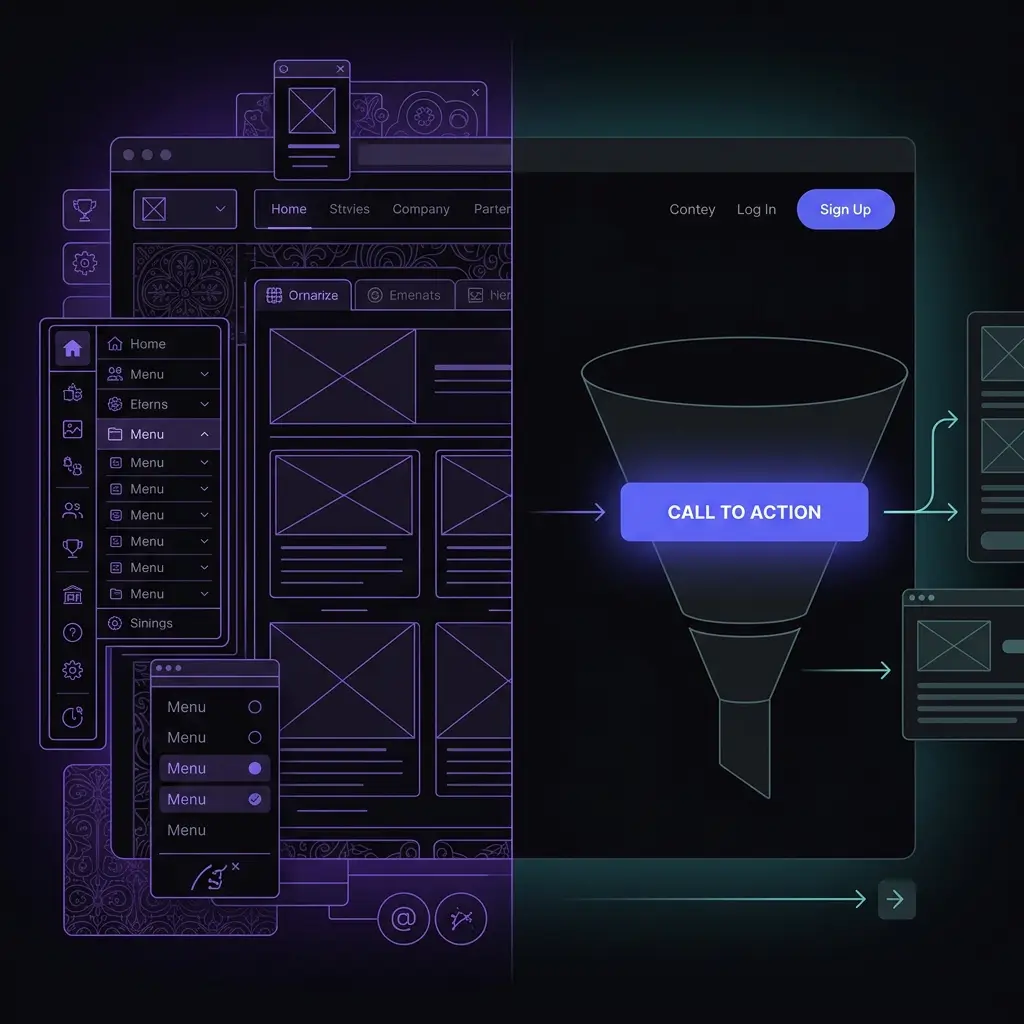
1. Single and Visible CTA per Screen
Every page must have a single main objective. In a 2024 Unbounce study analyzing 750 landing pages, pages with multiple CTAs had 60% fewer conversions than those with a single clear CTA. The B2B decision-maker visiting your site has between 45 and 90 seconds of attention span. Do not waste that time asking them to do 5 different things.
2. Visual Hierarchy Tailored for Diagonal ScanningHotjar heatmaps consistently show that B2B users scan pages in an F or Z pattern — they never read word for word. The headline, the first paragraph, the bullet points, and the CTA are the only elements guaranteed to receive attention. Everything else is supporting context. Designing for linear readers in 2026 is designing for no one.
3. Social Proof at the Exact Moment of PainThe most common mistake on Colombian B2B sites: putting testimonials at the very bottom of the page, after the prices. Consumer neuroscience is clear — social proof must appear right before or during the moment of risk consideration. In our projects, moving testimonials above the contact form increases conversions by 18% to 34%.
"After redesigning our site's UX architecture with Ingruvo, our cost per qualified lead dropped by 42% in 60 days. Same ad spend, less friction on the site, more conversions." — Digital Marketing Director, Tech Company, Bogota.4. Speed as a Core Feature of Design
A simple design that loads in 1.2 seconds converts significantly higher than a visually stunning design that takes 4.8 seconds. Google, Amazon, and Walmart have internal data showing direct correlations between every 100ms improvement in load speed and conversion increases. Design does not live in Figma — it lives in your potential customer's real browser, on a 15 Mbps 4G connection.
5. WhatsApp as the Primary CTA in Latin AmericaIn the Colombian market specifically, the WhatsApp button converts 3 to 5 times more than a traditional contact form. The reason is cultural and behavioral: the perceived friction of a form ('When will they respond? Did it go through?') is higher than that of a direct message. Your design must reflect the actual behavior of your market, not just Silicon Valley standards.
Metrics You Must Monitor on Your B2B Site
If you are not measuring this, you cannot improve it: conversion rate by traffic source (organic vs. paid vs. referral), average scroll depth per page, time-on-page for forms (where they abandon), mobile vs. desktop bounce rates, and click heatmaps using Hotjar or Microsoft Clarity.
At Ingruvo, every design decision is justified by data, not aesthetic preferences. Design is a hypothesis. The user is the one who votes.